INVENTING POP ABSTRACTION
Nicholas Krushenick (1929-1999)
Featured in Art in America, Feb. 2015 Issue
“The pure products of America go crazy,” wrote William Carlos Williams. And if such lost souls don’t crash and burn, which they often do, their craziness is sometimes channeled into original artistic expression. Even then, those “pure products” might have a hard time getting along or fitting in. Nicholas Krushenick (1929-1999) made paintings that are simultaneously idiosyncratic and inevitable, melding Pop and abstraction seemingly before anyone else thought to do it—a fusion that has survived its original moment to seem more vital than ever. Although he enjoyed considerable success in his lifetime, Krushenick wasn’t catapulted into the front rank of American painters, where he arguably deserves to be. Part of the reason is that his paintings are ornery, and so was he. What’s more, the American cultural milieu tends to favor specialization, while Krushenick’s work is too Pop for the abstract purists and too abstract for Pop’s populism. Maybe that’s why it doesn’t look dated in the least.
In fact, Krushenick’s paintings are now enjoying a well-deserved resurgence of interest, based partly on exhibitions at Mitchell Algus, Marianne Boesky, Gary Snyder and Garth Greenan, all in New York, and partly on the first extensive survey of his work, which opens this month at the Tang Museum at Skidmore College in Saratoga Springs, curated by museum director Ian Berry.
As papers in the Archives of American Art make clear, Krushenick was less interested in concocting a hybridized style than in being forthrightly an artist of his time, aiming for a singular greatness. This didn’t mean rejecting influences entirely, however. He would routinely discuss his excitement over Henri Rousseau, his respect for Picasso and his general awe of Matisse, whom he considered the greatest artist of the 20th century. A 1959 exhibition of Matisse cut-outs at New York’s Museum of Modern Art prompted Krushenick’s own pivotal shift into flat color with stark figure/ground contrast. (One is compelled to wonder what impact MoMA’s latest exhibition of the cut-outs, closing Feb. 10, will have on emerging artists.)
Krushenick was born in the Bronx in 1929 and grew up there, in a borough that conjures tough scenes and tough people. But his neighborhood was fairly quiet. Although his public schools were cash poor, the education was solid, and Krushenick was proud of getting good grades. He always wanted to be an artist and was constantly drawing and making models. His father was a Ukrainian immigrant, and he had a brother—John, older by two years—for companionship and rivalry. With a fierce attachment to his own impressions and goals, the young Nicholas wasn’t much of a joiner, preferring to make things with his hands rather than to engage in high school sports or social activities. He left school at the age of 17 to join the Army. The war had ended the previous year, and his plan was to use the GI Bill to pursue his real interest. In effect, he joined the Army to go to art school.
Two years later, Krushenick was out of the military and back in New York. After a brief stint as a construction worker on the Major Deegan Expressway, he enrolled in the Art Students League, which he later described as having “the worst collection of instructors one could ever get.” He did meet and study with Hans Hofmann, whom he respected while not liking his work, and he even encouraged his buddy from the Bronx, Al Held, to sign up at the Art Students League as well.
Once finished with school, Krushenick struggled to assimilate Picasso, much as the Abstract Expressionist generation had done before and during the war. He then proceeded to struggle with Hofmann. John had by then followed Nicholas into art-making, and the two Krushenick brothers joined the Camino Gallery, a 10th Street co-op, in 1957. The pair soon grew frustrated with the other members’ conservatism, however. So they left Camino to start what would become one of the great co-op galleries of all time, Brata—its name a spin on brati, the Ukrainian word for “brothers.” Among the members were Al Held, Ed Clark, Yayoi Kusama, George Sugarman and Ron Bladen.
By the late ’50s, Krushenick was presenting hieratic arrangements of brushy, planar forms, still animated by gesture and outlined in black or near-black strokes. The segmented cruciforms of an untitled 1959 acrylic-on-paper triptych evince some of the high-minded, tragic angst of Abstract Expressionism, but there is an emergent, antic quality to a dogleg form that seems to enter the picture on the left, predictive perhaps of the marching hairy legs that were to tromp through Philip Guston’s pictures some 10 years later.
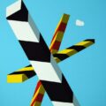
Once he committed to abstraction, Krushenick never again painted representational forms, though he sometimes came close and seemed to be perpetually on the verge of depicting some nearly recognizable spaces, the first being the emblematic, two-dimensional space of the graphic sign. Krushenick’s work from 1960 and 1961 uses the letters X and O, which have a kind of geometric purity. The areas of paint get flatter, though there is still a rough, expressionistic edge to his forms. Nevertheless, the characteristic posterlike flatness of the artist’s mature work was imminent.
Before being deeply moved by the Matisse show at MoMA, Krushenick had experimented with collage and assemblage works that bear a passing resemblance to Pierre Alechinsky’s cartoonishly bordered gesturalism. But by the early ’60s, he was slowing down his own animated marking into more fixed patterns, pushing the invocation of movement almost entirely into design rather than touch. He began using Liquitex acrylic to produce flat matte shapes in vivid spectrum hues. Separating the colors with a narrower band of black sustained their distinct chromatic intensities, much as lead cames do in stained glass windows or black outlines in comic books.
The first painting that Krushenick considered to be fully his own is another untitled canvas from 1961, featuring a blue bulb bound in black against a white ground. The form hangs from a black horizontal band at the top of the painting and is cradled in the hollow of an undulating yellow band also bordered by black. The bottom third of the painting is a black plane, so the salacious cupping between the blue and yellow bands appears to be taking place in midair.
By 1962, the artist had set his course with the imagery and spatial intervals that we recognize as his signature style: shapes are outlined in black, colors are high-key and flat, and, while some forms undulate, a threshold space often abuts the stretcher bars, establishing a rectilinear geometry that plays against the quasi-organic shapes. The paintings are deeply disciplined, but at the time their graphic boldness and hot colors made them seem loud and brash, even against the backdrop of the emerging Pop aesthetic. The chief forms of the 1962 and ’63 paintings are slightly wavy bands of one color that interweave into webbing patterns, as well as fluttery extended triangles that could allude to feathers, flames or the jungle leaves of Krushenick’s beloved Rousseau. And it may be a sign of increasing confidence that he titled several of the paintings with a sense of humor: Rousseau Giving Love and Lions (1962) and Turn Back Columbus(1963). But these first mature paintings are anything but pristine. Ridges from previous designs—and sometimes even entirely different paintings—are visible under the otherwise flat acrylic color.
By 1965, Krushenick’s imagery shifted to circus-tent bands of alternating color and fleshy folds that overlap in optically recessive layers, as inBattery Park (1965), or play off against regimental stripes, as in Son of King Kong (1966). In nearly every painting, the artist establishes a sense that one pattern crosses another with very little diminution in scale, like two-dimensional ducks in a shooting gallery. The carny associations arise through the purposeful artificiality of his shallow, non-perspectival space. Spatial illusion exists in his paintings only as a gestalt reading of two or more patterns and the vivid yet freezing flat blue that may lie “behind” equally flat swaths of sizzling yellow and red. As in Coney Island sideshow banners, everything in these paintings is a sign for movement and space rather than a convincing representation of gestures or orthogonally diagrammable depth.
The easy comparison was with Roy Lichtenstein, which Krushenick bore gracefully, but the abstraction and kooky boldness of his images link him more closely with his gallery mates at Brata. Certainly Krushenick’s organic folds comport with the packed tendrils of Kusama’s “Compulsion Furniture” series (1964), while his intense polychromes share a sensibility with images by Held and Sugarman.
At the time, Frank Stella was using bright commercial paints in pieces like Hyena Stomp (1962), but such works still assert an Apollonian cool that the Brata group had set out to demolish. Their work didn’t look like each other’s, but it shared a sense of optimistic brashness and goofiness, a quality that European critics of the day termed “American.” With a Surrealist hangover, inflected by Pop and Minimalism, the Brata artists barreled into a highway barrier of pop-culture graphics. This was the era of legendary illustrator Jack Kirby at Marvel Comics and of Ed “Big Daddy” Roth, the creator of the bug-eyed, slobbering hot-rod horror Rat Fink. Krushenick, the kid from the Bronx who spiritually never left, could feel it all and saw the cultural moment, in its totality, as a decisive break from the past. Even Held became Europeanized in Krushenick’s eyes, and their friendship ultimately waned.
In 1967, Krushenick made a number of large shaped paintings on wood panel, such as The Red Baron and Steeplechase, using cartoonish cloud outlines to disrupt brightly striped linear forms. Other painters such as Ed Clark and Sven Lukin had previously investigated shaped painting, but none approached Krushenick’s graphic punch. And he continued to push beyond the object constraints of the stretched canvas. Besides the shaped canvases, and the silkscreen posters he was to make a year later, Krushenick also designed sets and costumes for a performance of Haydn’s comic opera Il Mondo della Luna (The Man in the Moon) at the Tyrone Guthrie Theater in Minneapolis in conjunction with his 1968 survey exhibition at the Walker Art Center. In 1971, he executed an exterior mural in Fort Worth, Tex., that sadly no longer survives.
Krushenick moved to a harder edged, more regimented geometry in the late ’60s, and virtually all of these compositions have banding that runs along and reiterates the rectangular borders of the canvas like an interior frame. In Outspan (1968), the yellow band seems to peel back from the lower right corner into the red interior like a curtain ruffle, revealing a section of white background and red banding underneath. The painting teases at creating trompe l’oeil space while remaining resolutely 2-D and abstract.
Subsequent works reveal rows of forms that look like white piano keys behind triangular or sharply serrated rows of chromatic stripes. When the openings to the apparent space behind are bordered by jagged bands in the manner of comic book explosions, I’m reminded of Norman Mailer’s line about a Muhammad Ali punch arriving like “a wrecking ball from outer space.” Only instead of Oscar Bonavena’s chin, the crash point is the picture plane.
As his forms became more irregular throughout the ’70s and ’80s, Krushenick usually notched a framing band into corners or along a side of his works. In the ’90s, the artist’s final decade, even his space grew freer, while his color retained its high-key, backlit artificiality. These paintings quote their own space, producing an effect that is both ironic and uncanny.
There are moments in the history of art when these two effects, usually bent on undoing each other, coincide. Krushenick’s paintings are akin to representation in the way they expose and tie their own perceptual operations to their thingness, but the works never become something we’re sure we know. Instead, they twist and crease, morph into tooth, claw and lightning bolt, and resolve back into abstract patterns in a prolonged instant-constantly open, like all signs, to both the rules and vagaries of interpretation.
STEPHEN WESTFALL is a New York-based painter who writes about art. See Contributors page.